


Web forms play an essential role in turning visitors to your site into customers. However, web forms cannot convert these same visitors if they’re not keeping them engaged.
In other words, if a user abandons your web form before filling out essential information or hitting submit, you’ve just lost a lead, and therefore, revenue.
Looking for web form examples that show how to optimize for engagement? Let’s explore three.
But first, here’s more background on what web forms are, why they matter, and what makes a great web form.
Why Making Web Forms Engaging Matters
Web forms are a great way to both gather and make sense of potential customer data as prospects travel through the sales funnel.
Remember that web forms are more than just integrated ways to mine data from users to your site. They also:
- Encourage user interaction and enhance the user experience.
- Reduce friction.
- Provide visitors to your site options to get in touch or provide key information.
- Increase conversion rates.
Key Elements of Engaging Web Forms
The best and most effective web forms are designed with conversion and the user experience in mind. To that end, engaging web forms are also:
- Well-designed (direct and simple is good).
- Shorter rather than longer.
- Formatted such that easy-to-fill out sections appear first and more labor-intensive sections appear last (to reduce abandonment).
- Easy to navigate (single-column forms keep users scrolling).
- Optimized for desktop and mobile.
- Incorporate auto-filling to reduce friction.
What Are Some Examples of Forms That Optimize Engagement?
The following are three key form design examples that have been intentionally designed to optimize engagement, courtesy of HubSpot.
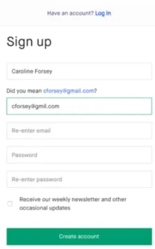
1. Sign-Up Form (Kickstarter)
Kickstarter’s sign-up form isn’t needlessly complex. But as HubSpot emphasizes, that’s a good thing. It employs a straightforward approach with one goal in mind: bait the hook. In other words, it does what it needs to effectively without much fuss. This form:
- Is set against a simple white background, eliminating distraction and emphasizing the form fields.
- Avoids asking too much of customers, which is important when attempting to optimize engagement.
- Is formatted in a single column to keep readers scrolling (and converting).
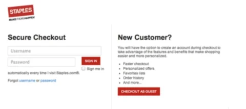
2. Guest Checkout Form/Login Form (Staples)
Have you ever combed through a company’s website, found what you needed, went to check out, and then found out that you needed to create an account to complete your purchase? Us too…and sometimes, you just don’t have the time or desire to create yet another username and password combination to remember.
Enter guest checkout forms.
This one from Staples provides new customers the ability to checkout inetead of bouncing off-page to a competitor, while also avoiding losing too many account-holders by emphasizing the benefits of skipping the guest checkout in favor of signing up for account access.
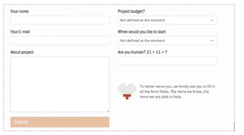
3. Contact / Estimate Form (UX Passion)
Surprised that a UX company makes this list of well-designed web forms? No? Neither are we! But here’s why we (and HubSpot) love their contact form example:
- Though it asks for a decent amount of information, it does so with an explanation: “The more we know, the more we are able to help.”
- The form differentiates between quality human leads and bots with the inclusion of the question “Are you human?” and an equation to fill out.
For Custom Web Forms That Convert, Use PerfectApps
You could attempt to create your own web forms by combing through an onslaught of standard form examples, if you’re confident in your coding skills. Or, you could hire a developer.
But there’s an easier, quicker, and more affordable way: create custom web forms that are conversion- and engagement-optimized with PerfectApps’ no-code web form builder.